Code & Be Happy
  • Home
  • Privacy Policy
  • Sitemap
  • Contact Us
Code & Be Happy

Kitchen Splashbacks: Template Tips, Corners, And Angles

  • Radovanovic Miljan
  • February 14, 2026
Source: rearo.co.uk

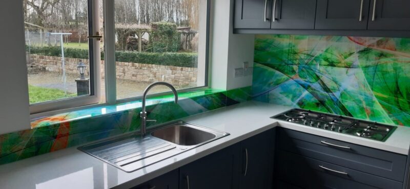
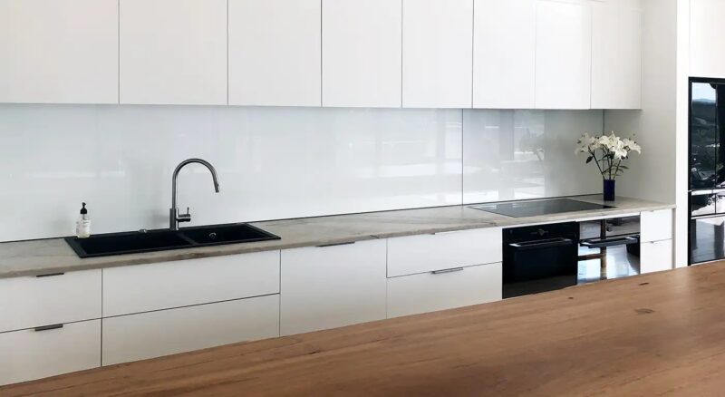
Glass splashbacks are a simple way to add colour and a clean, seamless look to a kitchen. They are easy to wipe down and they reflect light, which can make the whole space feel brighter.

Still, the final result depends on getting the colour and finish right. This is why samples and careful colour matching matter, especially when you order made to measure panels.

Colour matching basics and what can shift the shade

Source: work-tops.com

With made to measure glass splashbacks, colour matching usually starts with a reference, such as a paint code, a cabinet sample, or a swatch. The supplier then creates a backing colour that aims to match your chosen reference as closely as possible.

Even when a colour is matched accurately, it can look different on glass than it does on a wall or on timber. Glass reflects light and has a smooth surface, so colours often appear deeper and more crisp.

Lighting can also change perception. Warm LEDs can push whites and neutrals toward cream, while cool lighting can make greys and blues feel sharper.

Another factor is the glass type itself. Standard clear glass can have a slight green tint that may affect pale colours, while low iron glass can improve the look of whites and light tones.

Because of these variables, it is best to treat colour matching as a process rather than a one step decision. A good supplier will help you understand what is realistic and how to minimise surprises.

Why samples are essential before you commit

Source: premierrange.co.uk

Samples help you see the real shade in your own kitchen rather than under showroom lighting. A small sample panel can reveal whether the colour feels too warm, too cool, too dark, or too bright next to your worktop and cabinets.

Test the sample in daylight and again in the evening. You should also view it under under-cabinet lighting, because that is where reflections and glare become most obvious.

Place the sample vertically on the wall or prop it up at the correct height. A splashback is viewed upright, and colours can feel slightly different when seen flat on a worktop.

If your kitchen includes tiles, stone, or patterned worktops, check the sample right beside those materials. This makes it easier to spot clashing undertones before you place an order.

It is also smart to confirm the sample represents the final build, including the same glass type and the same backing method. A sample that is not produced in the same way can lead to mismatched expectations.

Finish choices and how they affect the final look

Source: premierrange.co.uk

The finish you choose changes both style and cleaning. Glossy glass is the most common option because it looks sleek and enhances colour depth.

Gloss can reflect light strongly, which helps brighten kitchens, but it can show fingerprints and water spots more easily. If you cook often, you may need to wipe it down more frequently to keep it looking spotless.

Matte finishes create a softer, more understated look. They reduce glare from lighting and can hide smudges better, although heavy textures can sometimes take longer to clean.

Edge finishing also matters for the overall impression. Polished edges look more premium, and slightly rounded corners can reduce the chance of chipping during handling and fitting.

Finally, accurate measuring supports a clean finish. Cutouts, corners, and small clearances should be planned properly so the panel fits neatly and does not look rushed.

Conclusion

Made to measure glass splashbacks look their best when colour matching is done carefully and confirmed with real samples. Testing the shade under your own lighting helps you choose with confidence and avoid surprises.

By selecting the right finish and paying attention to details such as glass type and edge quality, you can achieve a splashback that looks modern, consistent, and easy to live with for years.

Radovanovic Miljan
Radovanovic Miljan

Hey, I'm Miljan, the content editor over at codeandbehappy.com. My main gig is making sure our blog content is top-notch, from start to finish. But when I'm not glued to my desk, you'll catch me on the court swinging a racket or reminiscing about my glory days on the football field. Playing sports has taught me a ton about discipline, strategy, and teamwork – skills that come in handy both on and off the job. Plus, I'm a bit of a tech geek, always staying up-to-date with the latest gadgets and innovations.

Previous Article

Why Great Apps Start With Better Planning, Not More Features

  • Gavrilovic Verica
  • January 22, 2026
View Post
Table of Contents
  1. Colour matching basics and what can shift the shade
  2. Why samples are essential before you commit
  3. Finish choices and how they affect the final look
  4. Conclusion
Featured
  • 1
    Kitchen Splashbacks: Template Tips, Corners, And Angles
    • February 14, 2026
  • 2
    Why Great Apps Start With Better Planning, Not More Features
    • January 22, 2026
  • 3
    Smart Travel Accessories That Make Every Trip Easier
    • December 15, 2025
  • 4
    Munich Clubs Worth Visiting in 2025
    • November 7, 2025
  • 5
    What Are The Benefits Of Hiring Virtual Reality Software Developers?
    • October 15, 2025
Must Read
  • 1
    How Much Should Your Business Budget for Web Design in 2024?
  • 2
    Is Singapore the Next Silicon Valley for Digital Nomads and Coders?
  • 3
    How to Get an Online Date in France: Relationship Tips and Advice
Contact us

desk@codeandbehappy.com

Code & Be Happy
  • Home
  • Privacy Policy
  • Sitemap
  • Contact Us

Input your search keywords and press Enter.