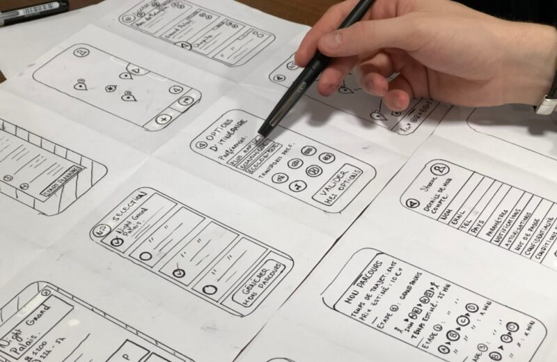
If you are a designer, we are sure that you are a very creative person who wants to give your best in work. We are also sure that you are very familiar with Wireframe as well.
This concept is mainly used to demonstrate the functionality of the project you are working on. Wireframes could best be approached as a blueprint for mobile and web applications. This, usually black and white draft, allows you to lay the foundations of your future product and notice in time what works well and what doesn’t. It will help you see all the elements of your project more clearly on the screen. This most often includes elements such as: site navigation (main, secondary, tertiary and footer), banners, and blocks of copy, buttons, calls-to-action, image blocks and the like.
This process is by no means simple. You can do it manually, with a team, independently or digitally. Here are some Practical Tips for Designing Better Wireframes.
The key is to make it clear what you really want
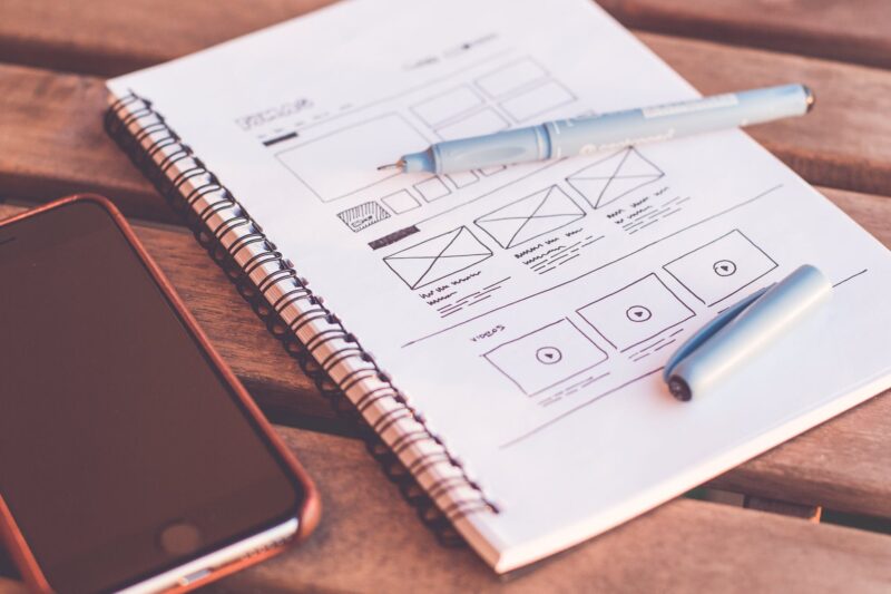
First, ask yourself a simple question: what do you really want to achieve by installing these wireframes? If you do not have a defined goal, you can waste both time and effort wandering. That’s why we suggest you make a small sketch of all the ideas on paper. While wireframe may be your favorite design tool, putting an idea on paper can’t be bad, on the contrary. You know that going while in your head is one thing and as soon as it starts to materialize, everything looks much different. Improvise on paper, try as many ideas as possible and see their advantages and disadvantages. We are looking for the best of as many versions as possible.
“To whom is addressed this what I’m doing?”
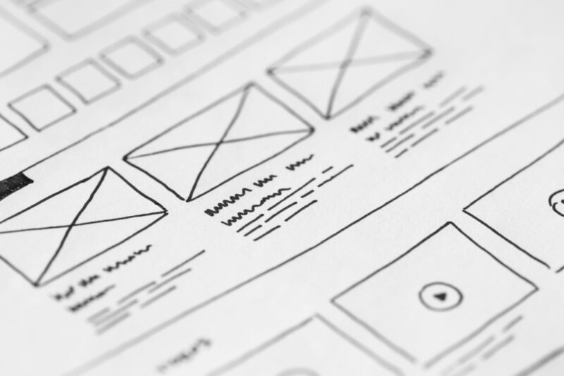
This would be the key question number two, which you must ask yourself before the action itself. Who is your audience? How could your audience reach you? What message are you sending them?
These are all guidelines that could help you to gather information about your future customers as accurately as possible. It would be good to ask them specifically what they expect or what they need through surveys or focus groups that you can post on social media. Their answers will give you guidelines at the start and point you to the pros and cons of your idea.
Consistency is very important
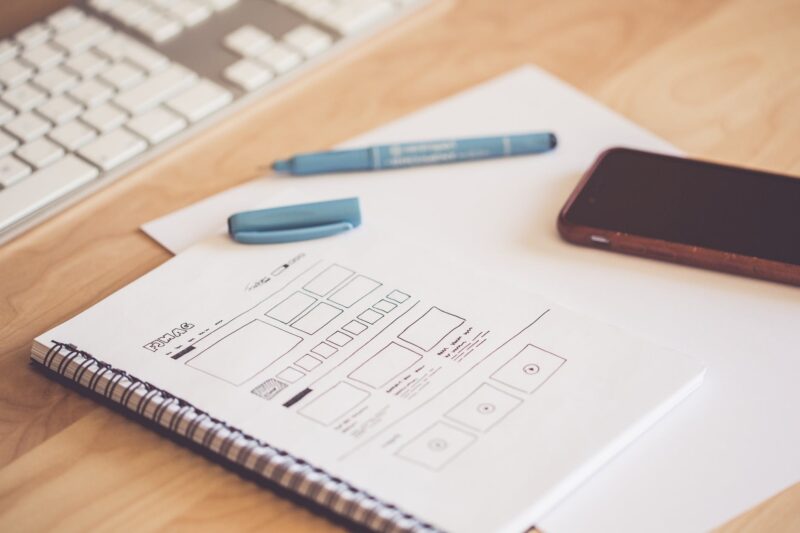
Yes, consistency is something you need to stick to for your project to be successful. Certain elements of the user interface must be consistent. Labels, buttons, tabs should have consistency, as well as fonts, color shades, spaces and the like. Find the ideal concept and stick to it.
Don’t run away from colors
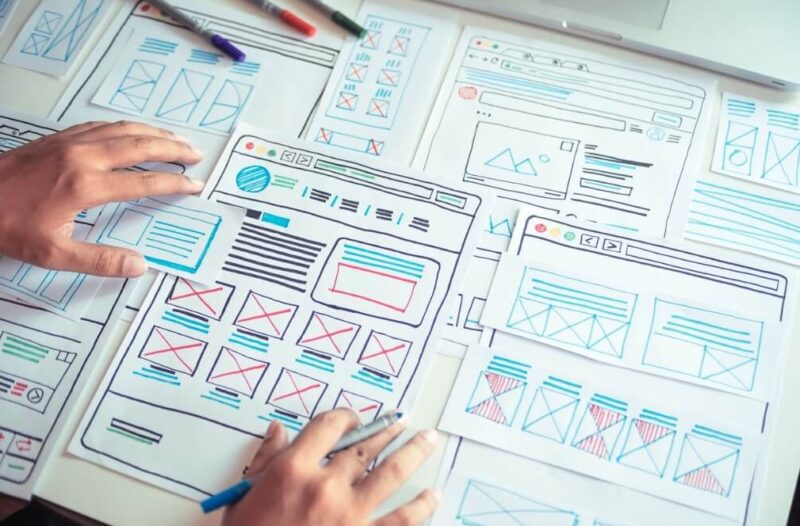
Colors are your ally when it comes to aesthetics or they can simply serve to guide users. Many designers avoid colors at this stage because they are afraid that they may distract attention. But if you have a clear vision of what things should look like, colors are also allowed in wireframes.
